Introduction to Matplotlib and alternatives
(gallery)
The default library to plot data is Matplotlib. It allows one the creation of graphs
that are ready for publications with the same functionalites as Matlab.
# these IPython commands load special backend for notebooks
# %matplotlib widget
%matplotlib inline
When running code using matplotlib, it is highly recommended to start IPython with the
option --matplotlib (or to use the magic IPython command %matplotlib).
import numpy as np
import matplotlib.pyplot as plt
You can plot any kind of numerical data.
y = [1, 2, 10, 0, 5, 2]
plt.plot(y);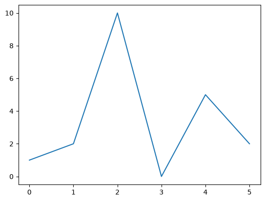
In scripts, the plt.show method needs to be invoked at the end of the script.
We can plot data by giving specific coordinates.
x = np.linspace(0, 2, 20)
y = x**2
plt.figure()
plt.plot(x, y, label="Square function")
plt.xlabel("x")
plt.ylabel("y")
plt.legend();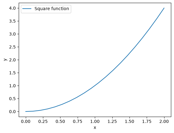
We can associate the plot with an object figure. This object will allow us to add labels, subplot, modify the axis or save it as an image.
fig, ax = plt.subplots()
lines = ax.plot(
    x,
    y,
    color="red",
    linestyle="dashed",
    linewidth=3,
    marker="o",
    markersize=5,
)

ax.set_xlabel("$Re$")
ax.set_ylabel(r"$\Pi / \epsilon$");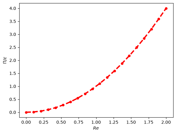
We can also recover the plotted matplotlib object to get info on it.
line_object = lines[0]
type(line_object)matplotlib.lines.Line2Dprint("Color of the line is", line_object.get_color())
print("X data of the plot:", line_object.get_xdata())Color of the line is red
X data of the plot: [0. 0.10526316 0.21052632 0.31578947 0.42105263 0.52631579
0.63157895 0.73684211 0.84210526 0.94736842 1.05263158 1.15789474
1.26315789 1.36842105 1.47368421 1.57894737 1.68421053 1.78947368
1.89473684 2. ]
Example of multiple subplots
fig, axes = plt.subplots(nrows=2, ncols=1)
ax1, ax2 = axes
X = np.arange(0, 2 * np.pi, 0.1)
ax1.plot(X, np.cos(2 * X), color="red")
ax2.plot(X, np.sin(2 * X), color="magenta")
ax2.set_xlabel("Angle (rad)")
fig.tight_layout()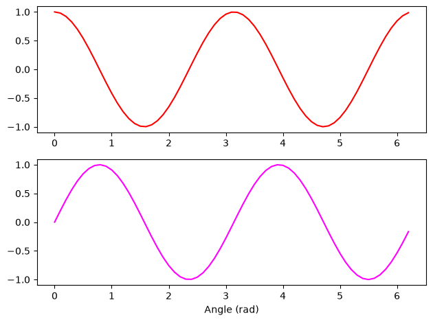
Titles, labels and legends
Titles can be added to figures and subplots. Labels can be added when plotting to generate a legend afterwards.
x = np.arange(0, 2, 0.01)

fig, ax = plt.subplots()
ax.plot(x, x**2, label="$x^2$")
ax.plot(x, x**3, label="$x^3$")
ax.plot(x, np.exp(x) - 1, label="$e^{x} - 1$")
ax.set_title("ax title")
ax.legend()
fig.suptitle("FIG TITLE", fontweight="bold");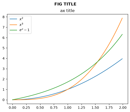
Note that legends are attached to subplots. Note also the difference between the subplot title and the title of the figure.
Saving the figure
Figures can be saved by calling savefig on the Figure object
fig.savefig("/tmp/my_figure.png")Anatomy of a Matplotlib figure
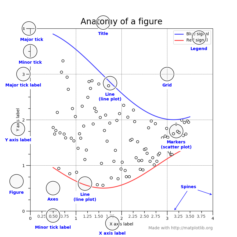
For consistent figure changes, define your own stylesheets that are basically a list of
parameters to tune the aspect of the figure elements. See
https://
2D plots
There are two main methods:
imshow: for square grids. X, Y are the center of pixels and (0,0) is top-left by default.pcolormesh(orpcolor): for non-regular rectangular grids. X, Y are the corners of pixels and (0,0) is bottom-left by default.
noise = np.random.random((10, 10))

fig, axes = plt.subplots(1, 2)
axes[0].imshow(noise)
axes[1].pcolormesh(noise);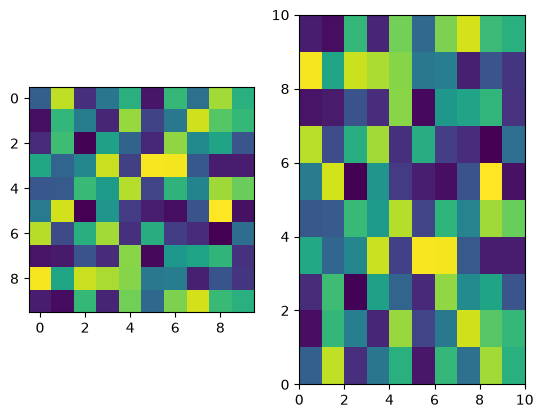
We can also add a colorbar and adjust the colormap.
fig, ax = plt.subplots()
im = ax.imshow(noise, cmap=plt.cm.gray)
plt.colorbar(im);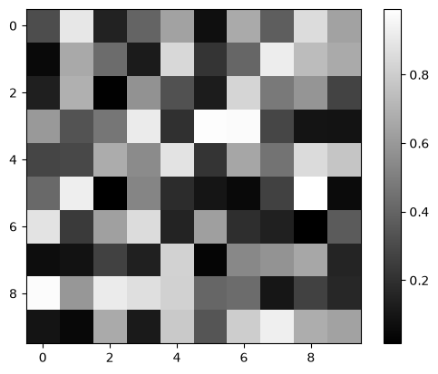
Meshgrid
When in need of plotting a 2D function, it is useful to use meshgrid that will generate a 2D mesh from the values of abscissa and ordinate.
x = np.linspace(-2 * np.pi, 2 * np.pi, 200)
y = x

mesh_x, mesh_y = np.meshgrid(x, y)
Z = np.cos(2 * mesh_x) + np.cos(4 * mesh_y)

fig, ax = plt.subplots()
pcmesh = ax.pcolormesh(mesh_x, mesh_y, Z, cmap="RdBu")
fig.colorbar(pcmesh);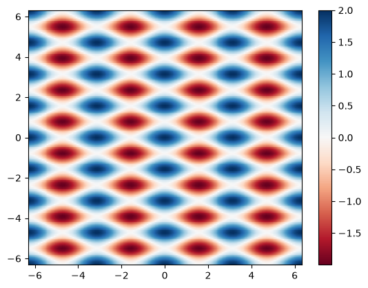
Choose your colormaps wisely !
When doing such color plots, it is easy to lose the interesting features by setting a colormap that is not adapted to the data.
As a rule of thumb:
use sequential colormaps for data varying continuously from a value to another (ex:
x**2for positive values).use divergent colormaps for data varying around a mean value (ex:
cos(x)).
Also, when producing scientific figures, think about how your plot will look to colorblind people or in greyscales (as can happen when printing articles).
See the interesting discussion on matplotlib website:
https://
And this very important article on the scientific (mis)use of colour:
https://
Other plot types
Matplotlib also allows to plot:
Histograms
Plots with error bars
Box plots
Contours
in 3D
...
See the gallery to see what suits you the most.
# 3D example
from mpl_toolkits.mplot3d import Axes3D

fig = plt.figure()
ax = fig.add_subplot(111, projection="3d")

ax.plot_surface(mesh_x, mesh_y, np.exp(-(mesh_x**2 + mesh_y**2)), cmap="viridis");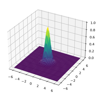
Alternatives to Matplotlib
Matplotlib can do a lot...but not everything, and the learning curve is steep.
Here are some other Python libraries to check out to go further:
Seaborn: built on top of Matlpotlib, specifically for statistical graphics, integrates closely with
pandasdata structuresBokeh: JavaScript-powered visualization (without writing any JavaScript yourself)
HoloViews: for interactive data analysis and visualization (on top of Bokeh or Matplotlib), seamless integration with Jupyter Notebooks, complex visualization (composites)
Datashader: (on top of HoloViews) support very large datasets (handling overplotting, saturation...) thanks to Numba, Dask (CPU cores/processors distribution) and CUDA (GPU)
Vega-Altair: accessible declarative visualization library, notebook-friendly, but dataset size limited
and more!
Differences in grammar, syntax complexity, consistency...