
Introduction to Matplotlib and alternatives#
Todo
Based on https://matplotlib.org/, in particular https://matplotlib.org/stable/users/explain/quick_start.html and https://matplotlib.org/stable/gallery/index.html.
Mention Vega-Altair
(gallery)
The default library to plot data is Matplotlib. It allows one the creation of graphs
that are ready for publications with the same functionalites as Matlab.
# these IPython commands load special backend for notebooks
# %matplotlib widget
%matplotlib inline
When running code using matplotlib, it is highly recommended to start IPython with the
option --matplotlib (or to use the magic IPython command %matplotlib).
import numpy as np
import matplotlib.pyplot as plt
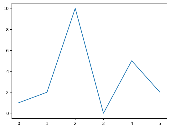
You can plot any kind of numerical data.
y = [1, 2, 10, 0, 5, 2]
plt.plot(y);
In scripts, the plt.show method needs to be invoked at the end of the script.
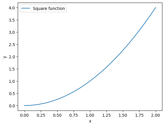
We can plot data by giving specific coordinates.
x = np.linspace(0, 2, 20)
y = x**2
plt.figure()
plt.plot(x, y, label="Square function")
plt.xlabel("x")
plt.ylabel("y")
plt.legend();
We can associate the plot with an object figure. This object will allow us to add labels, subplot, modify the axis or save it as an image.
fig, ax = plt.subplots()
lines = ax.plot(
    x,
    y,
    color="red",
    linestyle="dashed",
    linewidth=3,
    marker="o",
    markersize=5,
)

ax.set_xlabel("$Re$")
ax.set_ylabel(r"$\Pi / \epsilon$");
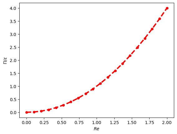
We can also recover the plotted matplotlib object to get info on it.
line_object = lines[0]
type(line_object)
matplotlib.lines.Line2D
print("Color of the line is", line_object.get_color())
print("X data of the plot:", line_object.get_xdata())
Color of the line is red
X data of the plot: [0.         0.10526316 0.21052632 0.31578947 0.42105263 0.52631579
 0.63157895 0.73684211 0.84210526 0.94736842 1.05263158 1.15789474
 1.26315789 1.36842105 1.47368421 1.57894737 1.68421053 1.78947368
 1.89473684 2.        ]
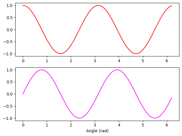
Example of multiple subplots#
fig, axes = plt.subplots(nrows=2, ncols=1)
ax1, ax2 = axes
X = np.arange(0, 2 * np.pi, 0.1)
ax1.plot(X, np.cos(2 * X), color="red")
ax2.plot(X, np.sin(2 * X), color="magenta")
ax2.set_xlabel("Angle (rad)")
fig.tight_layout()
Titles, labels and legends#
Titles can be added to figures and subplots. Labels can be added when plotting to generate a legend afterwards.
x = np.arange(0, 2, 0.01)

fig, ax = plt.subplots()
ax.plot(x, x**2, label="$x^2$")
ax.plot(x, x**3, label="$x^3$")
ax.plot(x, np.exp(x) - 1, label="$e^{x} - 1$")
ax.set_title("ax title")
ax.legend()
fig.suptitle("FIG TITLE", fontweight="bold");
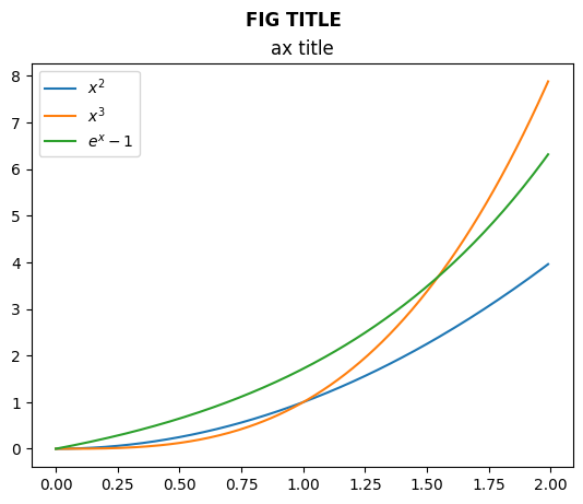
Note that legends are attached to subplots. Note also the difference between the subplot title and the title of the figure.
Saving the figure#
Figures can be saved by calling savefig on the Figure object
fig.savefig("/tmp/my_figure.png")
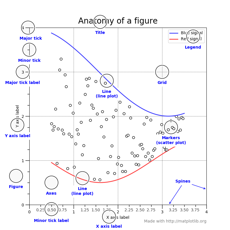
Anatomy of a Matplotlib figure#
For consistent figure changes, define your own stylesheets that are basically a list of parameters to tune the aspect of the figure elements. See https://matplotlib.org/tutorials/introductory/customizing.html for more info.
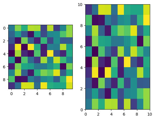
2D plots#
There are two main methods:
imshow: for square grids. X, Y are the center of pixels and (0,0) is top-left by default.pcolormesh(orpcolor): for non-regular rectangular grids. X, Y are the corners of pixels and (0,0) is bottom-left by default.
noise = np.random.random((10, 10))

fig, axes = plt.subplots(1, 2)
axes[0].imshow(noise)
axes[1].pcolormesh(noise);
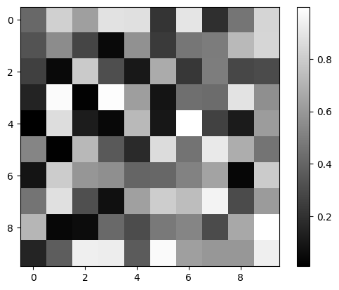
We can also add a colorbar and adjust the colormap.
fig, ax = plt.subplots()
im = ax.imshow(noise, cmap=plt.cm.gray)
plt.colorbar(im);
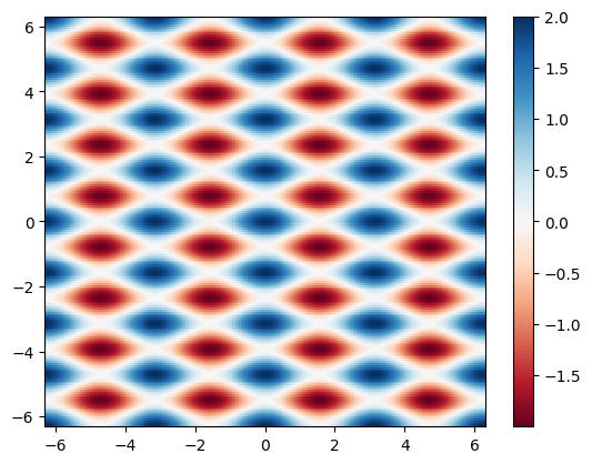
Meshgrid#
When in need of plotting a 2D function, it is useful to use meshgrid that will generate a 2D mesh from the values of abscissa and ordinate.
x = np.linspace(-2 * np.pi, 2 * np.pi, 200)
y = x

mesh_x, mesh_y = np.meshgrid(x, y)
Z = np.cos(2 * mesh_x) + np.cos(4 * mesh_y)

fig, ax = plt.subplots()
pcmesh = ax.pcolormesh(mesh_x, mesh_y, Z, cmap="RdBu")
fig.colorbar(pcmesh);
Choose your colormaps wisely !#
When doing such color plots, it is easy to lose the interesting features by setting a colormap that is not adapted to the data.
As a rule of thumb:
use sequential colormaps for data varying continuously from a value to another (ex:
x**2for positive values).use divergent colormaps for data varying around a mean value (ex:
cos(x)).
Also, when producing scientific figures, think about how your plot will look to colorblind people or in greyscales (as can happen when printing articles).
See the interesting discussion on matplotlib website: https://matplotlib.org/users/colormaps.html.
And this very important article on the scientific (mis)use of colour: https://www.nature.com/articles/s41467-020-19160-7
Other plot types#
Matplotlib also allows to plot:
Histograms
Plots with error bars
Box plots
Contours
in 3D
…
See the gallery to see what suits you the most.
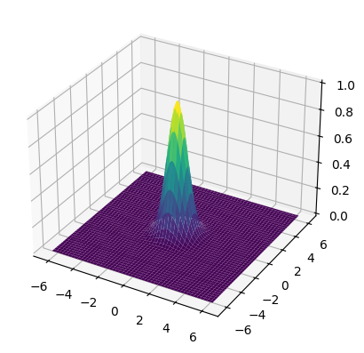
# 3D example
from mpl_toolkits.mplot3d import Axes3D

fig = plt.figure()
ax = fig.add_subplot(111, projection="3d")

ax.plot_surface(mesh_x, mesh_y, np.exp(-(mesh_x**2 + mesh_y**2)), cmap="viridis");
Alternatives to Matplotlib#
Matplotlib can do a lot…but not everything, and the learning curve is steep.
Here are some other Python libraries to check out to go further:
Seaborn: built on top of Matlpotlib, specifically for statistical graphics, integrates closely with
pandasdata structuresBokeh: JavaScript-powered visualization (without writing any JavaScript yourself)
HoloViews: for interactive data analysis and visualization (on top of Bokeh or Matplotlib), seamless integration with Jupyter Notebooks, complex visualization (composites)
Datashader: (on top of HoloViews) support very large datasets (handling overplotting, saturation…) thanks to Numba, Dask (CPU cores/processors distribution) and CUDA (GPU)
Vega-Altair: accessible declarative visualization library, notebook-friendly, but dataset size limited
and more!
Differences in grammar, syntax complexity, consistency…